Fenway Typography Collection
Kari Everson & Taiyo Hasegawa | Spring ’20 | Studio
Prompt:
Find something you are curious about or would like to explore. Step away from your computer and think about different ways of capturing content to tell your story. Think about the process and blending content, story, and design.
Overview - The Bigger Picture:
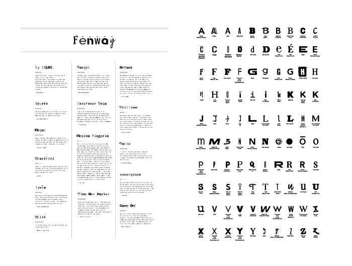
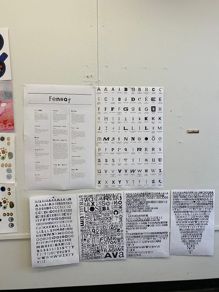
Our project is all about typography found in the Fenway Neighborhood area. Both of us live in the Fenway neighborhood and so it seemed only fitting to find a collection in a place that we both have a connection with and share in common. In a brief overview our project is an exploration of different typography found in Fenway signage. The letters found came from all different types of signage; from mostly restaurants, to stores, to recreational centers, etc. Using the type we found and collected we created type specimens, a Frankenstein “like” typeface (i.e. letters pulled from signage), a Fenway reviews poster, and a video using our made typeface. From this project we learned what can be found and made from collections.
Reflecting:
When looking back on our process and steps that we took in this project we would say that producing multiple iterations, phases, and styles were the key in producing our final outcomes. We both worked well together as well — splitting up the work, giving opinions, making decisions/choices, and communicating. We both are pretty organized people so we really stuck to a step-by-step process when doing this project. Producing multiple iterations, phases, and styles were key in our project because we had so much content we collected that this collection project could go in so many different directions as well as go on as a study for quite some time. To get to our final stages we needed to go through multiple different iterations to figure out what was working and what was not.
Brainstorming:
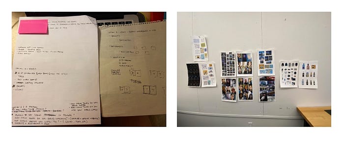
When first introduced to this project, we brainstormed all the different categories that we shared in common or had a lot of that we could potentially make collections out of. The categories that we initially brainstormed were: brands, writing utensils, drinks, selfie photos, iPhone usage/screen time, places spent most at in the Fenway neighborhood, hours spent watching videos (Netflix, YouTube, TikTok, etc), top music artist we listen to, and cooking vs. eating out. From there we chose our top 5 that we felt we could make a collection out of and after receiving feedback we came to the conclusion that we both have collected a lot of “selfie” photos and both spent a lot of time in Fenway. From there we started to collected as many selfie photos we could find of ourselves and think of different qualities/aspects of Fenway. This is when we thought about all the different types of signage typefaces that you can see in Fenway. And thus the collecting began and the start to our many iterations!
Phase #1:
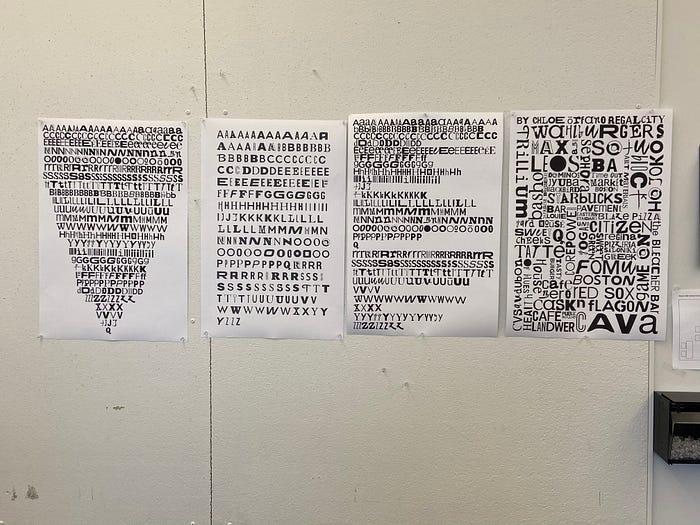
From the start we already had the idea that our video would be comprised of the selfie photos, and the two posters would be focused on Fenway typography. We felt that since the aesthetic of the “selfie” has very young, modern, digital vibes that it made sense to make it the video and keep it in the digital realm. When thinking of type there is so much history there, from the beginnings of the wooden letter press, newspapers, etc.; that making the Fenway type the analog part of the project seemed fitting as well. Our first iteration of the selfie video was played out in a split screen calendar, showing the day and place each selfie was taken and using that information to create the commonality between both our photos. And our first iteration of the posters we collected all the letters from every place found in Fenway and organized them into 4 different poster groupings; capital letters (alphabetical order), greatest # of letter to least # of letter (alphabetical order), lowercase + uppercase (alphabetical order), recreating all the signs with different letters.
Phase #2:
After receiving feedback as well as being shown other works to get inspiration from we started to create our next round of iterations. Some of the works that were shown to us to get inspiration from that caught our attention was a book created by the team at Fathom Information Design in Boston. They had recreated Mary Shelley’s, Frankenstein, using fragments of PDF fonts found. They ended up calling this a FrankenFont. Knowing we had so many letters of all different styles we were inspired to create our own “Frankenstein” piece. This round of posters we created two new posters and edited two past posters. One poster was a paragraph about the history of the Fenway area written in a Fenway FrankenFont that we created in the system, Glyphs. The second poster was a map of the Fenway neighborhood built entirely from the letters we had collected. And then the two previous revised posters we inverted them to see what they would look like with a black background and white letters.
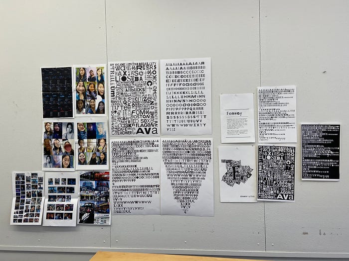
As for our selfie video we went back to the drawing board. We needed to make our video faster in pace and match the music we had chosen. The second video iteration we each created a video to have more options and both videos were of two totally different styles. We scrapped the calendar idea and we’ll be honest, designed more for form rather than content.
Phase #3:
In the previous iterations people really enjoyed our Fenway FrankenFont poster as well as drew our attention back to our type specimen posters. We also received some ideas for the content of our FrankenFont poster; instead of being about the history of Fenway it would be intriguing to do reviews about Fenway. So for this third round of iterations we created two new posters. One FrankenFont poster with ratings/reviews about restaurants in Fenway and the second poster a letter specimen with descriptions of where each letter was found.
The last video iterations did not go quite as aspected. Both videos weren’t working and so we made the decision to just not do the video about selfie photos. We scrapped the whole idea entirely. We went back to the drawing board and created a video using our Fenway FrankenFont instead.
Finally Fenway FrankenFont Finish:
For our final pieces we produced a Fenway review poster in our Fenway FrankenFont, a letter specimen poster, and a video typing out a waitresses/waiter’s speech in our Fenway FrankenFont as well. We learned a lot about collections from this project as well as how to work together; and we are really happy with our experience and outcome!
